INDUSTRY:
BRANDING
CLIENT:
Ecohome
YEAR:
2025
EXPERIENCE:
BRAND DESIGN

Ecohome
about.
The task was to create a new brand identity for Ecohome's post design. I used a soft UI style with rounded corners, inspired by digital apps and web interfaces. The background features a light green and light blue gradient to reflect the eco-friendly focus. For typography, I used Inter, with dark blue for high contrast and light green for lighter contrast, ensuring clear and aesthetic readability.
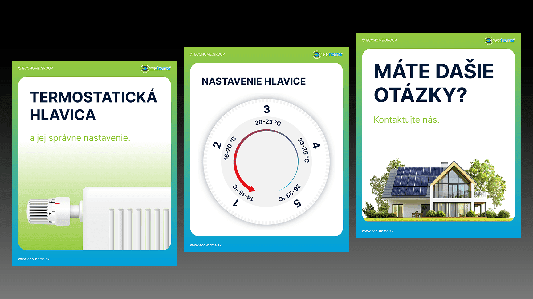
about 2.
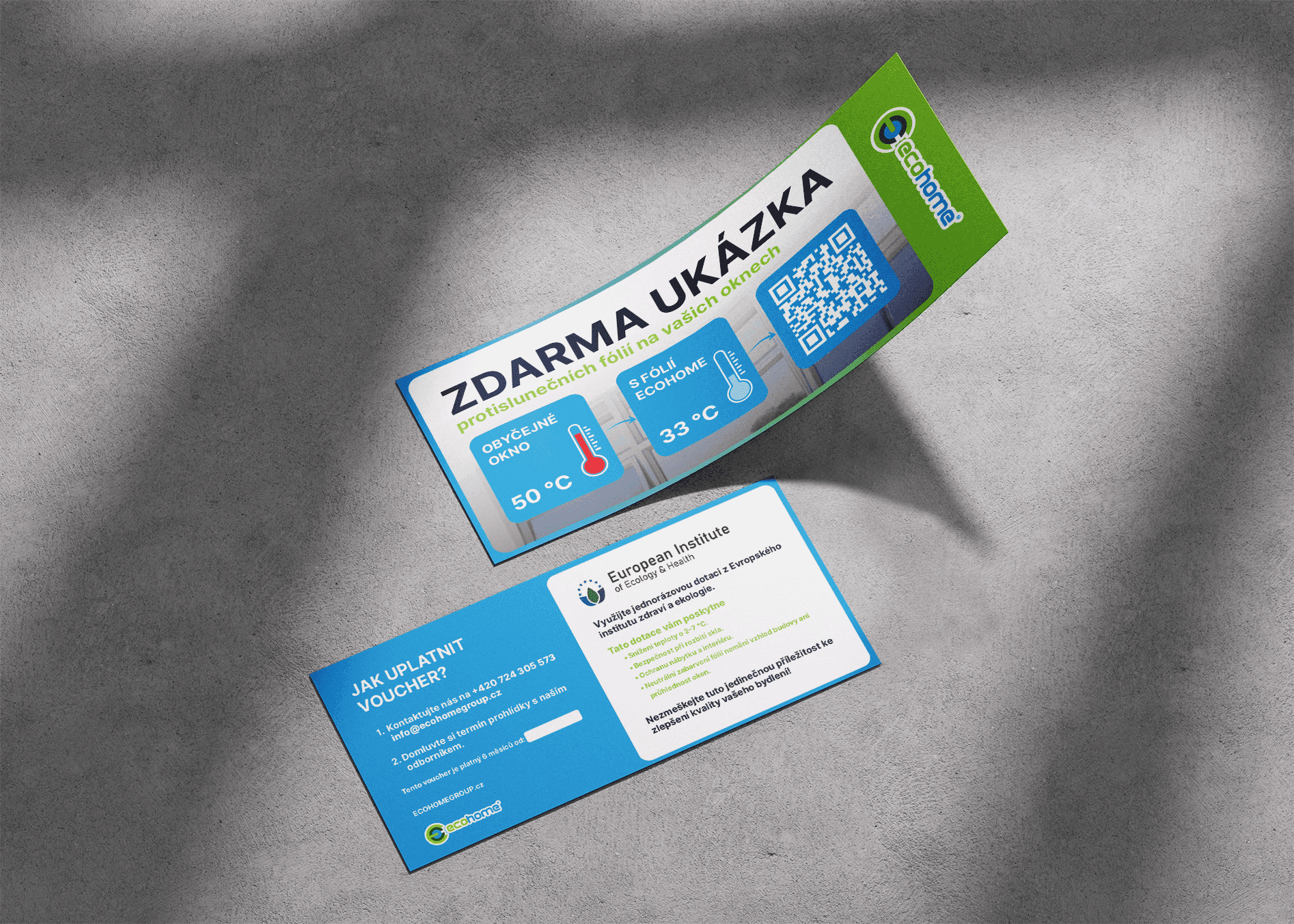
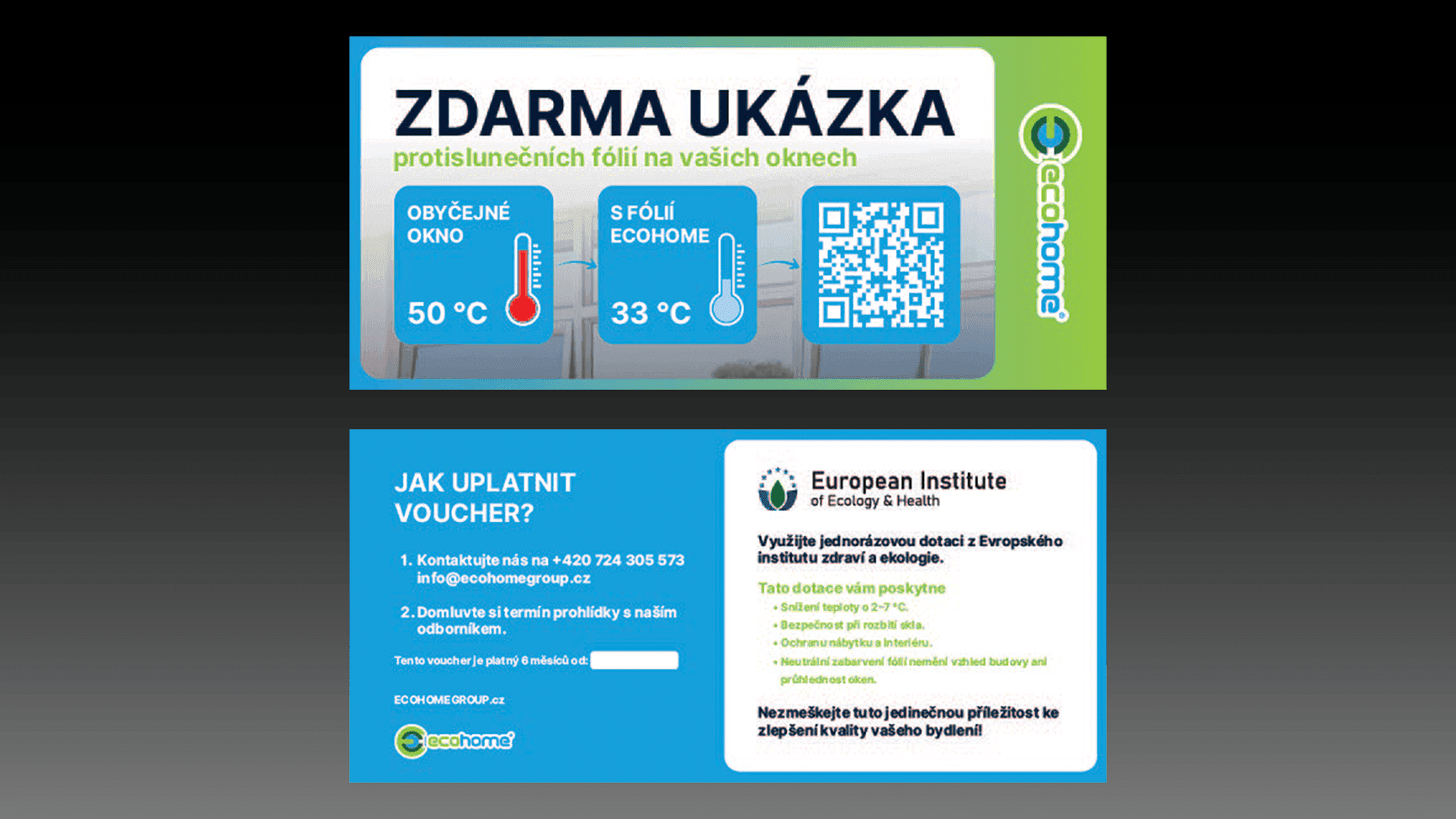
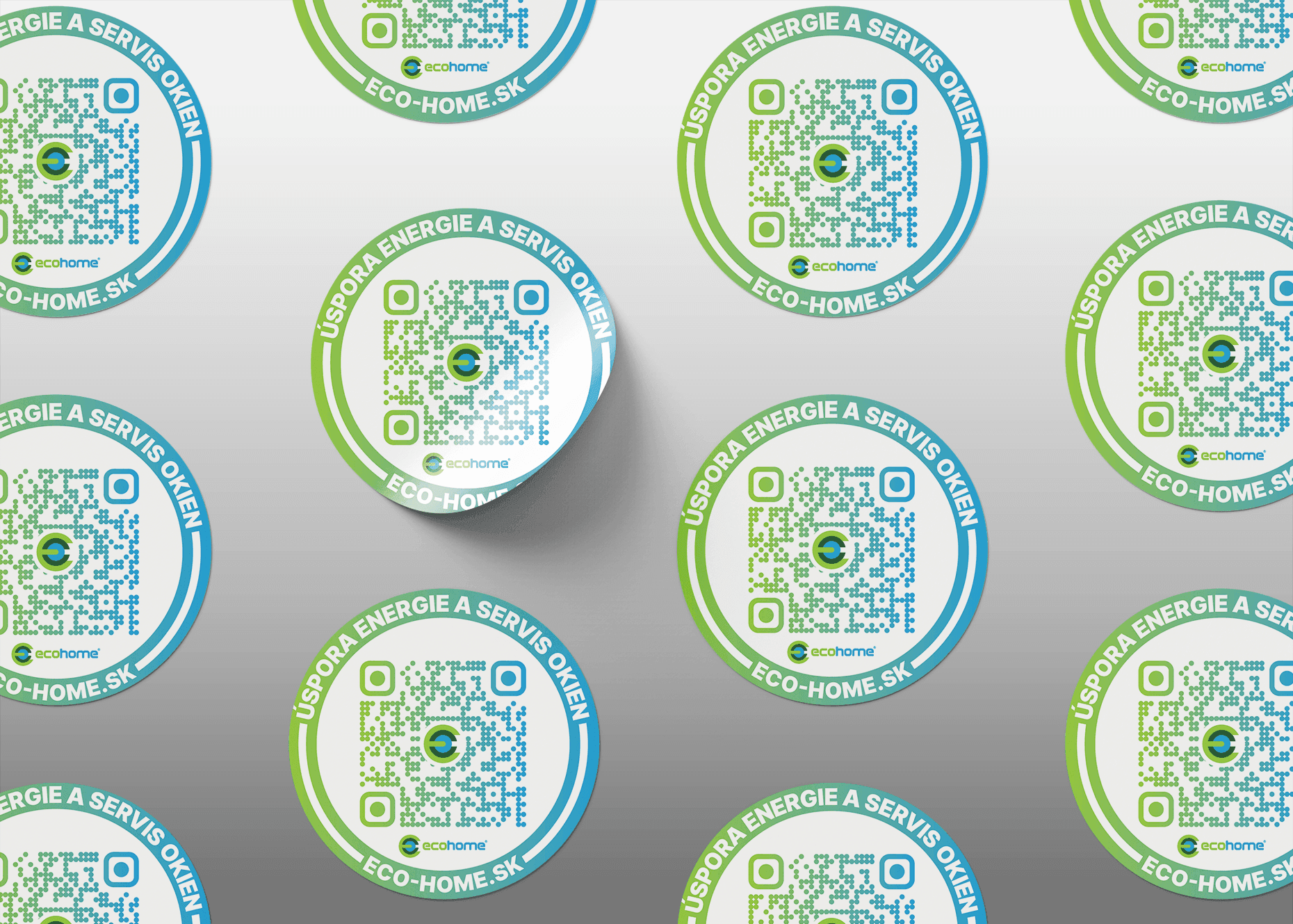
In the print materials, I continued the same digital-inspired visual language—rounded corners, clean layout, and the eco color scheme. Light green and light blue dominate the background, while text is set in dark blue for strong contrast and light green for subtle highlights, maintaining consistency and clarity across all formats.